- Summary of content
- Background
- Documents are hard to find
- Methods of comparison are left up to the fund
- Investment performance reporting by underperforming funds
- Fund analysis typically failed to consider demographic information
- Insurance reporting
- Fee comparisons
- What made for a good MOA?
- Recommendations for improving MOA quality
Update 31/08/21: A section of this post - investment performance reporting by underperforming funds - has been updated to incorporate the latest Your Future, Your Super performance test regulations.
Summary of content
For the first time, the regulator APRA has required super funds to publish annual ‘member outcomes assessments’ on their websites. These self-assessments show the extent to which funds actually help their members save for retirement and how they compare to other funds.
Super Consumers Australia analysed a sample of 42 super funds (listed here) which collectively cover 73% of all APRA fund members, with a mix of funds that perform well and poorly on the APRA heatmaps and a mix of large and small providers.
The member outcome assessments were usually hard to find on fund websites.
Every fund claimed they promoted their members’ best interests. Our analysis suggests 14 funds (33%) are likely to fail the Your Future, Your Super performance test.
The vast majority of funds compared their investment performance to a peer group. There was substantial variation in the type of peer group used and the comparison metric applied.
More than two thirds of funds (69%) used their own target return metric as one (sometimes the only) metric for assessing their investment performance.
Only a quarter of funds used cohort analysis.
Less than half of funds (48%) identified ways to improve the quality of their products.
Background
For the first time, the regulator APRA has required super funds to publish annual ‘member outcomes assessments’ on their websites. These self-assessments show the extent to which funds actually help their members save for retirement and how they compare to other funds. It is an important step to ensure funds justify how they are looking after their members’ best interests.
We decided to take a closer look at what funds are saying about themselves. We checked whether their reports are honest, clear, and published where their members will see them, as well as whether they made commitments to improve.
We found room for improvement in the first batch of reports. Of the 42 we have analysed, all but one fund in our sample claimed they’ve acted in their members’ best interests. This is concerning, considering that 33% of the MySuper funds in our sample would currently fail the upcoming legislated performance test, 41% have high fees as deemed by APRA1, and at least 14 funds have junk insurance according to our 2020 research on Total and Permanent Disability Insurance.2
Our analysis suggests greater prescription in the guidelines is required to direct funds. The legislation and APRA standards afford funds the discretion to choose their own content and methodology, which funds took and used as instruments of self promotion rather than honest self-assessments. Without further attention, the value of these reports will not be a valuable tool in holding funds to account. In this blog we document issues and put forward solutions to ensure the next round of MOAs genuinely helps members.
Documents are hard to find
Consumers are unlikely to come across the MOA if they are looking for information about their fund, as many funds bury MOAs in obscure sections of the website, like ‘governance and disclosure’. This made it difficult and time consuming to find the MOAs in our sample. We found:
7% (3) funds published their MOAs on their home page, and a little over half (55%) published their MOAs within 2 clicks of the home page.
14% weren’t findable on the website by ‘browsing’ or ‘searching’ within the website (we had to resort to using Google and seeking a direct pdf link).
Overall, just 31% were located in a prominent location on the fund’s website. That is, they were either published on the home page or they were located in a logical place and within 2 clicks of the home page.
While 86% of funds’ MOAs could be found via the fund’s website search bar, people need to know the precise name of the document and what search terms to use. As a result people looking for information about their fund are unlikely to find the report unless they know exactly what they are looking for.
Reports should be made easily available to members, the majority of whom will not have heard of the assessments, or know what they are called. For more engaged consumers and stakeholders who know what they are looking for, MOAs need to be prominent and published in a logical place like ‘Documents’, ‘Resources’ or ‘Publications’.
This could be solved by amending guidelines to specify where the reports should be published. Current proposed legislation will require these MOAs to be provided in advance in an annual notice before a fund’s annual general meeting.
Methods of comparison are left up to the fund
MOAs have significant room for improvement, particularly when it comes to like-for-like comparisons. Currently funds have discretion over the metrics, comparisons, time frames and cohorts used. This has led to the use of ‘vanity metrics’ which do not give consumers a clear indication of how the fund is performing against its peers.
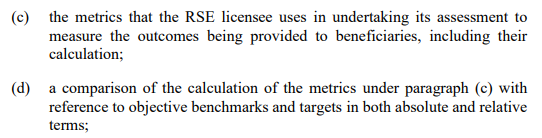
The Prudential Standard SPS 515 details that at a minimum, MOAs include the information in figure 1.
Figure 1 - information required for inclusion in MOA, SPS 515
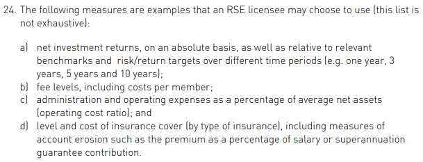
The Prudential Guide SPG 516 offers a selection of metrics to choose from (shown in figure 2 below), but none are mandatory.
Figure 2 - Suggested MOA metrics, SPG 516
Even for MySuper products, where the legislation states that funds must compare MySuper products with other MySuper products3, the Prudential Guide4 refers to examples for key outcome metrics that funds ‘may’ provide rather than that they ‘must’.
Funds used a smattering of methods, sometimes comparing themselves to all products and other times just to those they considered ‘comparable’. They used a mixture of performance metrics and there are examples of funds using the guidance to highlight their one year comparisons when it suited them while others resorted solely to lengthier, more reliable time periods. This lack of consistency and use of credible metrics made these MOAs less useful for consumers looking to compare long-term performance between funds.
We found super funds’ MySuper offerings used the methods in table 1 to compare investment performance.
Table 1 - Metrics used to assess MySuper product performance
| Performance metric | Number | pct |
|---|---|---|
| Average comparison group return | 31 | 74% |
| Fund’s own target return | 29 | 69% |
| CPI+X target return | 18 | 43% |
| Absolute rank in comparison group | 18 | 43% |
| Heatmap benchmark portfolio | 3 | 7% |
| Other metric | 2 | 5% |
Over half the funds (69%) set their own target return as a performance metric. With no mandate on which metric should be used by funds to give themselves a pass mark, it’s no surprise target returns were used as a low hurdle to clear. The Productivity Commission came to this same conclusion on target returns. In their fund performance analysis using a median MySuper target they found it produced no fund underperformers5.
The most common target return was meeting a self-determined ‘CPI+’ target. This is a measurement stemming from the Stronger Super reforms and product dashboards in the early 2010s. Although imposed on funds for the purposes of product dashboards, funds set this target themselves and have little incentive to set it above what the market might be expected to deliver on its own. In the context of the Productivity Commission inquiry it is no longer a robust measure of performance.
When it comes to comparing themselves with a passive version of themselves, in a similar form to the new legislated underperformance test, only 7% do. Going forward this will be the most important performance measure for funds.
40 of the 42 funds adhered to the legislation by comparing their MySuper product to other MySuper products in some form6. However, only 52% compared their product to all other MySuper product offerings. This was despite this method being suggested in the APRA guide as the most straightforward method for comparison7.
There was little consistency in how a fund selected the peers to compare itself against.
Table 2 - Comparison groups for MySuper product
| Comparison group | Number | pct |
|---|---|---|
| All MySuper products | 22 | 52% |
| A peer group selected based on investment risk | 14 | 33% |
| A fund selected peer group | 10 | 24% |
| A ratings agency selected peer group | 9 | 21% |
| No comparison group found | 2 | 5% |
The subset using some other peer group (24%) also highlights a problem with the broadness of the legislation and guidance. Here we have a quarter of the funds creating their own MySuper comparison groups based on who they think is ‘comparable’ to them to justify their performance. Most of the time there was a lack of clarity on how these groups were determined which made it hard to scrutinise how appropriate funds making their own peer groups is.
The APRA guide notes the risk for comparison bias, but trusted funds to avoid this bias. It is clear from the current set of MOAs that this trust has been misplaced. A better approach would be to require MySuper products to compare to all other MySuper products given they are default products. Funds should also be required to compare their returns to the Strategic Asset Allocation (SAA) benchmark portfolio, in other words the new performance test. If this superior approach was followed there would no longer be a need for self-serving target returns.
Investment performance reporting by underperforming funds
Update 31/08/21: This section has been updated to incorporate the most recent Your Future, Your Super performance test regulations. This has reduced the sub-sample of underperforming funds from 17 to 14.
In our sample, there are 14 funds that are likely to fail APRA’s upcoming investment performance test8. 12 of these funds are in the bottom quartile for six year net returns and the remainder are in the second worst quartile.
On average funds with poor investment performance also tended to produce poorer quality reports than their better-performing counterparts. They tended to rely more heavily on self-serving metrics like target returns (86% of underperforming funds compared to 61% of performing funds), ignore longer term results and used a lack of context and transparency to downplay their underperformance. We highlight their MOAs below:
Take AV Super, which has investment performance which will likely see it fail the APRA test. Their MOA stated that “AvSuper’s overarching investment objective for members of CPI + 3.5% per year, on average over rolling 10 years was met/exceeded” and therefore concluded that the financial interests of fund benefits are being promoted.
Or EISS Super, they attempted to explain away this underperformance by focussing attention on performance in the six months to 31 December 2020. This is outside the reporting period of the 2019/20 financial year relevant to this MOA. It is also a completely inappropriate time frame for assessing the relative performance of a long term investment like superannuation.
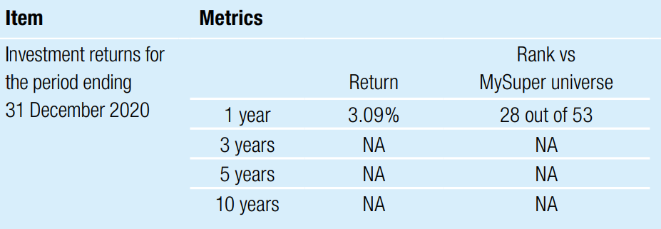
Maritime Super suffered from a similar flaw. They commenced a new strategy on 1 December 2019 and therefore thought it was best not to highlight their previous MySuper underperformance of the fund, as shown in figure 3. Responsible funds should be more transparent about past underperformance, even if they have since changed strategy. APRA have recently released an information paper which details their approach to combining the past net returns of products which have changed strategy. We expect funds to do the same and for APRA MOA guidance to direct this.
Figure 3 - Maritime Super performance table
AMG’s MySuper product used a graphic (figure 4) to detail how they exceeded their investment targets. Despite claiming it compared performance to ‘other similar products’ it made no reference to which products this comparison included. It also failed to achieve its target return over the 5 year period to 30 June 2020. Despite these failures it used the following graphic to claim it had outperformed its target.
Figure 4 - AMG Super investment performance graphic

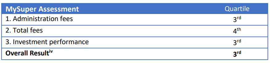
One of the most questionable methodologies came from Christian Super. This fund is likely to fail the underperformance test and is in the most expensive 25% in the market for fees, costing $645p.a. for a $50,000 balance. Christian Super created its own weighted methodology that determined its ‘overall result’, based on fees and performance, was within the best 50% of funds. We could not replicate Christian Super’s results in relation to their investment performance, despite using the same methodology9.
Figure 5 - Christian Super performance assessment table
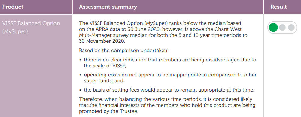
VISSF gave themselves a green light and used Chant West’s super fund ratings to justify their performance. Chant West uses a Multi-Manager survey which separates by growth weighting. This comparison group may not be exhaustive of all relevant mysuper offerings and may include some non-mysuper offerings. There is a clear motive in using metrics that benefit the fund when providing their assessment rather than solely relying on APRA data as the image below shows.
Figure 6 - VISSF summary of MySuper investment performance
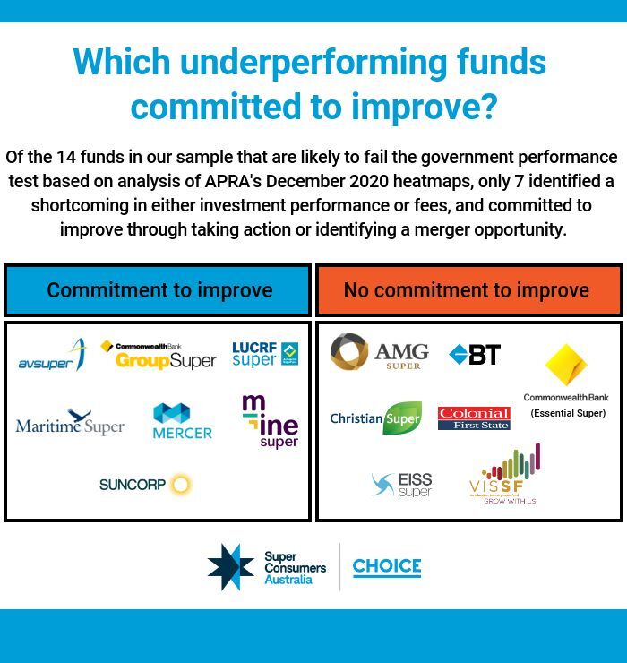
In the end, only 7 of the 14 funds identified a shortcoming in either investment performance or fees and committed to improve through taking action or identifying a merger opportunity. This is highlighted in figure 7.
Figure 7 - Graphic of underperforming funds commitment to improve performance
The need for standard performance measures
We recommend APRA amend its guidance to require funds to use heatmap measures in future MOAs and make standardised comparisons. For example, requiring a MySuper product comparison to all MySuper products. We understand this is in line with the Your Future, Your Super legislation.
It is also crucially important that going forward funds are directed to the heatmap data because choice product heatmaps will be released for the first time in 2021. This will give choice products nowhere to hide. APRA has foreshadowed this stating administration fees in the choice sector are notably higher than they are for comparable MySuper products.
Fund analysis typically failed to consider demographic information
Given the compulsory nature of superannuation, funds must cater to the needs of people from a wide range of demographics such as age, gender, and income level. These factors have a material impact on the outcomes a member will receive. A typical consideration would be ensuring the product adequately weighs the risk return trade off to maximise long term returns for younger members. Failure to do so will see life-long members retire with significantly lower balances. This consideration is reflected in item 17 of SPS 515, which calls on funds to “consider different cohorts of members when articulating outcomes.”
Unfortunately, our review shows that few funds adhere to this requirement. No fund broke down on a consistent basis how they ensured their product met the needs of key groups in their membership. Sunsuper was the only fund in our sample that stated they relied on cohorts to factor demographic data throughout its MOA, although it did not show this breakdown in its report. Another nine funds (21%) partially adhered to the guidelines by considering one or two demographic factors, such as age or balance size.
The remaining 76% of funds treated their membership profile as homogenous, neglecting to mention cohorts at all. This can result in poor outcomes for consumers. Prime Super is a fund that offers a restrictive TPD policy through the application of activities of daily living and daily work tests for individuals who are unemployed for six months. In the context of increasing unemployment as a consequence of the COVID-19 pandemic, restrictive definitions are likely to apply to a larger group of policyholders. Their assessment of insurance made no mention of the cohort of individuals who may work seasonally or be affected by the pandemic and be subject to a restrictive policy while still paying full price. Nor did the assessment consider whether this is warranted.
In the absence of any prescription from APRA, most funds are choosing to ignore cohort analysis. There is a strong case that a core set of cohorts should be taken into account by all funds, especially in relation to data they already hold on their membership. This includes age, balance size, indicative income and gender. This is a non-exhaustive list and funds should look to collect additional data like employment or rely on public sources to further refine their cohort analysis. We recommend APRA give specific guidance in SPS 515 on a base set of demographic information for funds to consider in constructing cohorts. We also recommend APRA use SPG 516 to encourage funds to collect and consider additional data to further refine their cohorts.
Additionally, there is a role for ASIC and APRA in setting expectations and giving guidance and, as necessary, enforcement to drive improvements in industry practice. We acknowledge that the Design and Distribution Obligations align well with the MOA obligations and should be used in concert to drive improved outcomes.
Insurance reporting
It is worth noting that our review of MOAs revealed funds have failed to take adequate action on insurance. We understand that is a challenging area to benchmark but it is disappointing to see so few detail quantitative metrics such as how members engage with and claim on their insurance, opt-out and opt-in rates for default members, claims pay-out ratios, claims handling procedures and processing times, claim withdrawal rates, the number of insurance-related disputes, the time taken to resolve disputes, and policy lapsing rates. All of which are in APRAs guide.
Our analysis found that only 33% of funds provided more than one metric in their insurance assessment to be scrutinised. Only 19% of funds made a commitment to improve their insurance or review their insurance in their MOA. This is disappointing, considering that many funds had junk insurance offerings during the reporting period (FY 2020).
Fee comparisons
Fees have clearly been an area of focus for funds with many making clearer statements of how they compare to the market and stronger commitments to improve. Notably there is less room for discretion in the comparison of fees, this made comparison easier and showed the value greater prescription in other areas could provide.
On the issue of fees, the difference between good and bad MOAs was stark. Compare Telstra’s MOA (which we consider poor quality) with QSuper’s. TelstraSuper did not provide graphical representation or quantitative analysis on any fee assessment, making the information harder to absorb.
Not only does this highlight the poor discretion offered on metrics, it also highlights the ability for funds to use purely quantitative and wordy assessments to mislead members. This amount of discretion on format makes apple-to-apple comparisons between funds nearly impossible.
Figure 8 - Comparison of fee presentation between Telstra and QSuper
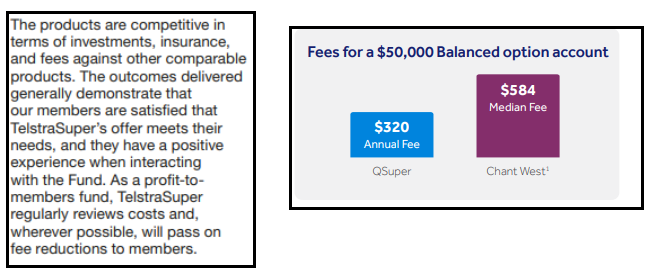
Unlike QSuper, TelstraSuper did not provide graphical representation or quantitative analysis on any fee assessment, making the information harder to absorb. Not only does this highlight the poor discretion offered on metrics, it also highlights the ability for funds to use purely quantitative and wordy assessments to mislead members. This amount of discretion on format makes apple-to-apple comparisons between funds nearly impossible.
CareSuper in their MOA not only hid their fee assessment at the bottom of their 6 page document but they incorrectly compared their $543 MySuper fee to the $604 industry average (Mysuper and Choice) and are now raising their fees on 1 July 2021.
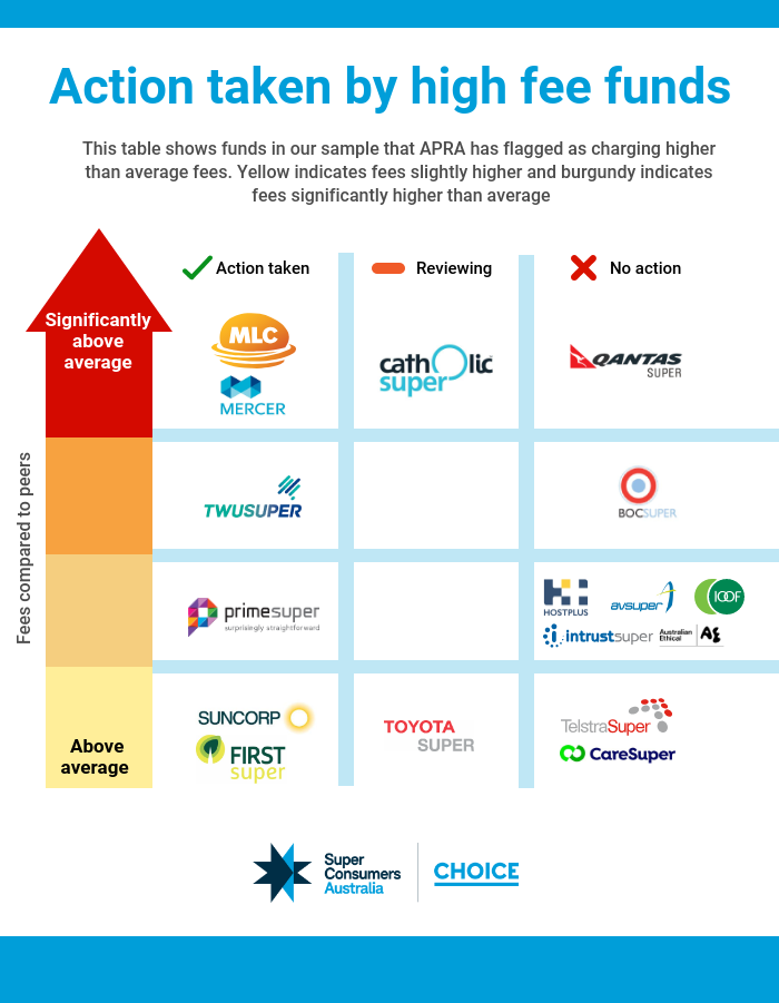
The table below (figure 9) highlights the action taken by high fee funds. We endeavour to follow up the commitments these funds made10.
Figure 9 - Action taken by funds (detailed in MOA) with relatively high fees
What made for a good MOA?
The best MOAs used clear, simple language. They were member-friendly and didn’t require finance expertise to understand them. MOAs that used visual representations like traffic lights or ticks were easily understood. They worked really well when the product was linked with comparable, objective measures, like the APRA heatmaps. This was mainly evident in the 48% of funds that identified at least one way to improve the quality of their products.
Comparable baseline measures of how a fund is tracking on fees and investment performance can be found in the APRA heatmaps. In our view, a fund which uses the MOA to acknowledge and respond to issues highlighted by the heatmaps is demonstrating a willingness to constructively engage with whether it is delivering good outcomes to its members.
Suncorp’s MOA is one of the better examples in our sample. It combined appropriate data use, clear performance indicators and made tangible commitments to improve. One of these includes committing to an administration fee reduction on 1 April 2021, which disproportionately impacts lower account balance members in their MySuper option.
Recommendations for improving MOA quality
The following recommendations are our suggestions on how these MOAs can be improved for next year:
Ensure funds display their member outcome assessments in a prominent position on their website.
Remove the discretion allowed in the format of assessments. Provide a guidance or template that ensures some form of consistency.
Mandate standardised comparisons:
Specify the MySuper metric to be used when comparing against all MySuper products. Trustee directed products should be directed to be compared to products with similar SAA bands.
Specifically, on returns:
Comparison to all MySuper at product level (This can’t be gamed and is appropriate as it is the default product). Lifecycle returns to be asset weighted.
Comparison to SAA benchmark portfolio/Performance test
Target returns should not form part of a funds assessment.
Specifically, on fees:
At a minimum, APRA’s disclosed fees and costs on a $50,000 balance.
Where appropriate to the target market, additional balances in line with APRA heatmaps.
Require funds to use a consistent historical time period that aligns with APRA heatmaps. (Discretion applicable to new-entrant funds)
Require funds to consider insurance for different cohorts and invoke standardised metrics
Claims acceptance rate
Claims handling timeframes
Cost per thousand dollars of cover
Eligibility criteria (Quality of cover metric)
Require funds to provide a ranking on each required assessment factor.
Require funds to include areas for improvement, along with commitments for each major consideration. This section should appear immediately after the fund’s overall determination of whether it’s promoting best interests.
APRA should establish a set of mandatory cohorts on a base set of demographic information (Age/balance/gender) that funds must construct so that they can better assess member outcomes. We also recommend APRA encourage funds to collect and consider additional data to further refine their cohorts. Additional data could include:
Income
Whether a member is partnered or single
Employment status
Whether a member owns their own home outright, owns their home with a mortgage, is a rent-vestor or is renting without owning other property at retirement
Whether a member is expected to receive a full, part-or-nil rate Age Pension at retirement
The age a member retires and/or starts to draw down from their superannuation
Fund’s in APRA’s December 2020 heatmaps which have total fees in excess of 1.15%.↩︎
Super Consumers Australia (2020) “Super funds take steps to improve TPD insurance terms”. While there is some overlap, the sample for the junk insurance study does not cover all funds in the present sample. ↩︎
Section 52(9) of the SIS Act 1993↩︎
Paragraph 26, Prudential Guide SPG 516↩︎
Productivity Commission Inquiry Report: Superannuation: Assessing efficiency and competitiveness, p140↩︎
Section 52(9) of the SIS Act 1993↩︎
Para 71, Prudential Guide SPG 516↩︎
Based on Super Consumers analysis of December 2020 APRA MySuper Heatmap data. Analysis aligns with the August 2020 Your Future Your Super regulations.↩︎
Christian Super defined all mysuper products as all single strategy products and the closest lifecycle stages to their products strategic growth asset allocation and used the three and six year returns from the APRA heatmap for the comparison. When our analyst replicated their methodology we found both their six year returns (both net and net investment) were bottom quartile and their three year returns were second quartile - neither being third quartile as they state in the member outcome assessment.↩︎
The funds in this table have a total balance fee of 1.15% or higher on a $50,000 balance. This is the point when APRA determines that a funds fees are relatively high and begins to apply a colour gradient.↩︎